
Appearance
全局组件
⭐⭐⭐⭐⭐
文件夹 src/components 内的组件使用 unplugin-vue-components/vite 插件自动引入并注册,页面中直接使用即可
图片上传
封装了 Element Plus 的 Upload组件, 提供图片上传、回显、拖拽排序、删除、查看大图功能,上传方法采用OSS前端直传的方式。使用方法:
html
<image-upload controller="article" v-model:url="row.thumbImg" :max="3"></image-upload>参数说明
| 名称 | 类型 | 是否必填 | 默认值 | 说明 |
|---|---|---|---|---|
| controller | string | 必填 | / | 控制器名称,用于指定图片文件夹,如果没有该文件夹将自动创建 |
| url | string | 必填 | / | 绑定的图片地址字段,多张图片用 , 隔开 |
| max | number | 选填 | 1 | 限制最大上传数量 |
| size | number | 选填 | 10 | 限制单次上传最大文件尺寸(M) |
| width | number | 选填 | 150 | 图片显示的宽度 |
| height | number | 选填 | 150 | 图片显示的高度 |
| notip | boolean | 选填 | false | 是否不显示底部的上传提示 |
| widthTip | number | 选填 | / | 显示的建议尺寸宽度 |
| heightTip | number | 选填 | / | 显示的建议尺寸高度 |
| ext | array | 选填 | ['jpg', 'png', 'jpeg'] | 支持的图片类型 |
| disabled | boolean | 选填 | false | 是否禁用,如果在 el-form 中使用,将会继承 el-form 上设置的 disabled 属性 |
效果图:

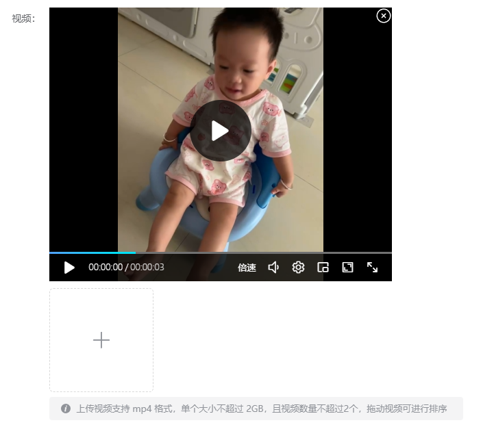
视频上传
视频播放使用了插件vue3-video-play,上传使用了 Element Plus 的 Upload组件,提供视频上传、回显、拖拽排序、删除功能,上传方法采用OSS前端直传的方式。使用方法:
html
<video-upload
  controller="article"
  v-model:url="formData.videoUrl"
  videoWidth="500px"
  videoHeight="400px"
  :max="2"
></video-upload>
参数说明
| 名称 | 类型 | 是否必填 | 默认值 | 说明 |
|---|---|---|---|---|
| controller | string | 必填 | / | 控制器名称,用于指定视频文件夹,如果没有该文件夹将自动创建 |
| url | string | 必填 | / | 绑定的视频地址字段,多个视频用 , 隔开 |
| muted | boolean | 选填 | false | 是否静音 |
| autoPlay | boolean | 选填 | false | 是否自动播放 |
| max | number | 选填 | 1 | 限制最大上传数量 |
| size | number | 选填 | 2 | 限制单次上传最大文件尺寸(G) |
| width | number | 选填 | 150 | 上传组件的宽度 |
| height | number | 选填 | 150 | 上传组件的高度 |
| videoWidth | string | 选填 | '600' | 视频组件的宽度 |
| videoHeight | string | 选填 | '400' | 视频组件的高度 |
| notip | boolean | 选填 | false | 是否不显示底部的上传提示 |
| ext | array | 选填 | ['mp4'] | 支持的视频类型 |
| disabled | boolean | 选填 | false | 是否禁用,如果在 el-form 中使用,将会继承 el-form 上设置的 disabled 属性 |
效果图:
远程下拉数据
快捷获取远程数据的下拉框,自动拼接接口地址:/${controller}/select,使用方法:
vue
<query-select v-model:value="row.articleTypeId" controller="articleType"></query-select>参数说明
| 名称 | 类型 | 是否必填 | 默认值 | 说明 |
|---|---|---|---|---|
| controller | string | 必填 | / | 控制器名称 |
| value | / | 必填 | / | 绑定值 |
| key | string | 选填 | 'id' | 数据主键 |
| label | string | 选填 | 'name' | 显示的标题 |
| clearable | boolean | 选填 | false | 是否显示清空按钮 |
| disabled | boolean | 选填 | false | 是否禁用 |
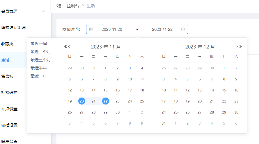
时间范围选择器
带有快捷选项的时间范围选择器,使用方法:
html
<date-range-picker
  v-model:startTime="query.startTime"
  v-model:endTime="query.endTime"
/>
参数说明
| 名称 | 类型 | 是否必填 | 默认值 | 说明 |
|---|---|---|---|---|
| startTime | string | 必填 | / | 开始时间,格式:2023-11-20 00:00:00 |
| endTime | string | 必填 | / | 结束时间,格式:2023-11-22 23:59:59 |
| clearable | boolean | 选填 | true | 是否显示清空按钮 |
效果图:
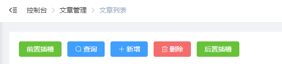
列表页工具栏
提供查询、新增、删除按钮,使用方法:
html
<list-toolbar :queryList="queryList" :addNew="addNew" :deleteList="deleteList"></list-toolbar>参数说明
| 名称 | 类型 | 是否必填 | 说明 |
|---|---|---|---|
| queryList | function | 选填 | 查询的函数,为空则不显示查询按钮 |
| addNew | function | 选填 | 新增的函数,为空则不显示返新增按钮 |
| deleteList | function | 选填 | 批量删除的函数,为空则不显示删除按钮 |
你也可以使用插槽定义自己的按钮:
html
<list-toolbar :queryList="queryList" :addNew="addNew" :deleteList="deleteList">
  <template v-slot:front>
    <el-button type="success" @click="addNew()">前置插槽</el-button>
  </template>
  <el-button type="success" @click="addNew()">后置插槽</el-button>
</list-toolbar>
效果图:
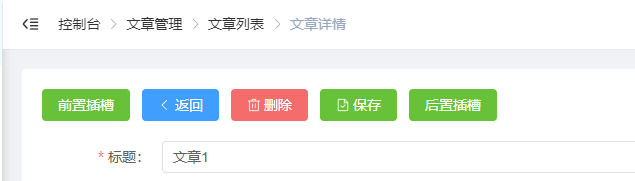
详情页工具栏
提供返回、删除、保存按钮,使用方法:
html
<form-toolbar :doBack="doBack" :doSave="doSave" :doDelete="doDelete"></form-toolbar>参数说明
| 名称 | 类型 | 是否必填 | 说明 |
|---|---|---|---|
| doBack | function | 选填 | 返回的函数,为空则不显示返回按钮 |
| doDelete | function | 选填 | 删除的函数,为空则不显示返删除按钮 |
| doSave | function | 选填 | 保存的函数,为空则不显示保存按钮 |
你也可以使用插槽定义自己的按钮:
html
<form-toolbar :doBack="doBack" :doSave="doSave" :doDelete="doDelete">
  <template v-slot:front>
    <el-button type="success" @click="addNew()">前置插槽</el-button>
  </template>
  <el-button type="success" @click="addNew()">后置插槽</el-button>
</form-toolbar>
效果图:
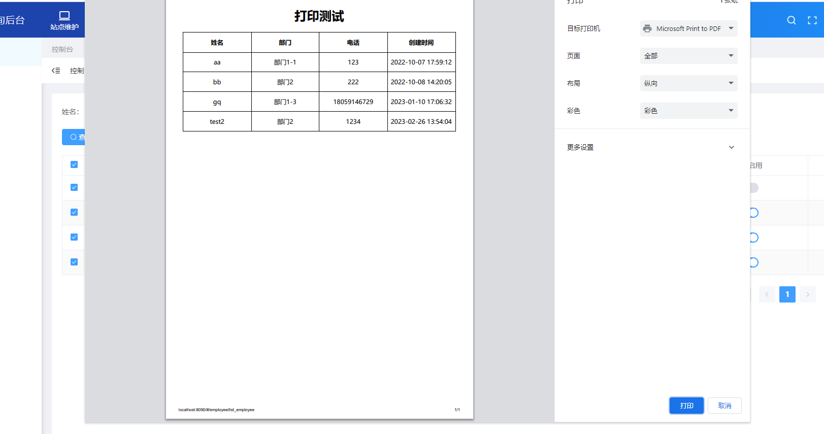
列表打印
封装插件print-js,提供针对列表数据的快捷打印按钮,使用方法:
html
<list-print :printList="selectedRows" :printColTitle="printColTitle" title="打印测试" />js
const opt = {
  controller: 'employee'
}
// 只打印已勾选的数据
const { selectedRows } = useList(opt)

// 定义需要打印的字段
const printColTitle = ref([
  { field: 'name', displayName: '姓名'},
  { field: 'departmentName', displayName: '部门'},
  { field: 'phone', displayName: '电话'},
  { field: 'createTime', displayName: '创建时间'}
])
参数说明
| 名称 | 类型 | 是否必填 | 默认值 | 说明 |
|---|---|---|---|---|
| printList | array | 必填 | / | 勾选的数据 |
| printColTitle | array | 必填 | / | 打印的字段 |
| text | string | 选填 | '打印' | 按钮文字 |
| title | string | 选填 | / | 打印标题 |
效果图:
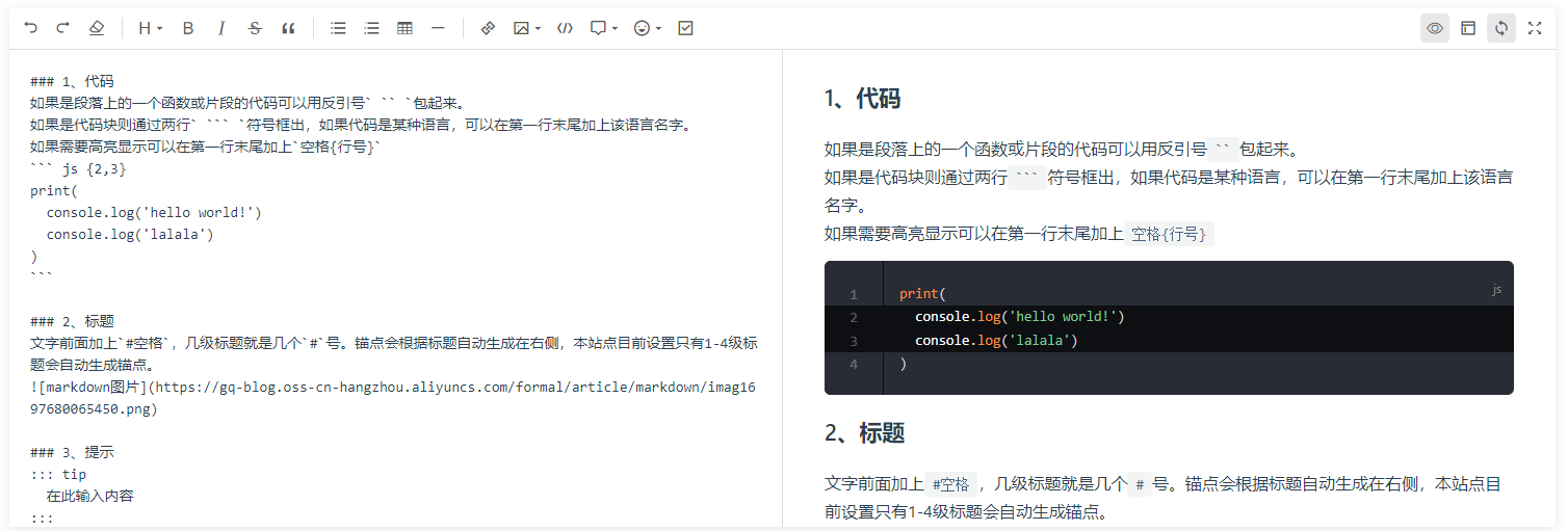
markdown编辑器
封装插件@kangc/v-md-editor,使用方法:
vue
// 此处绑定的值为md格式
<mdeditor v-model="row.markdownVal" />

<script setup>
import VueMarkdownEditor, { xss } from '@kangc/v-md-editor'

const row = ref({})
// 如果需要将 md 格式转为 html 格式可以使用以下方法
const content = xss.process(VueMarkdownEditor.vMdParser.themeConfig.markdownParser.render(row.value.markdownVal))
</script>
参数说明
| 名称 | 类型 | 是否必填 | 默认值 | 说明 |
|---|---|---|---|---|
| modelValue | string | 必填 | / | 绑定的数据 |
| height | string | 选填 | '500px' | 编辑器高度 |
| placeholder | string | 选填 | '请输入内容' | 占位文字 |
效果图:
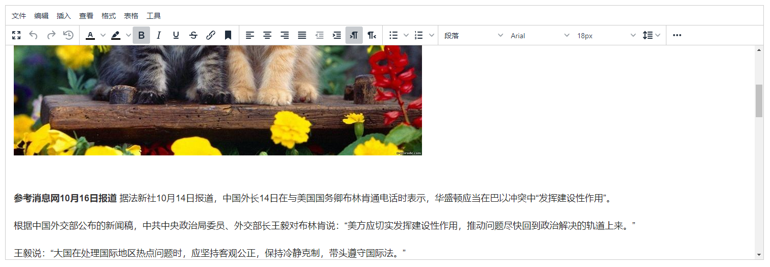
富文本编辑器
封装插件@tinymce/tinymce-vue,使用方法:
vue
// 此处绑定的值为 html 格式
<teditor v-model="row.content" />
参数说明
| 名称 | 类型 | 是否必填 | 默认值 | 说明 |
|---|---|---|---|---|
| modelValue | string | 必填 | / | 绑定的数据 |
| height | number | 选填 | 500 | 编辑器高度 |
| disabled | boolean | 选填 | false | 是否只读 |
效果图:
分页
列表分页组件,使用方法:
vue
<pagination v-model:pageIndex="query.pageIndex" v-model:pageSize="query.pageSize" :total="total" @page-change="queryList" />参数说明
| 名称 | 类型 | 是否必填 | 默认值 | 说明 |
|---|---|---|---|---|
| pageIndex | number | 必填 | 1 | 第几页 |
| pageSize | number | 必填 | 15 | 每页数据量 |
| total | number | 必填 | 0 | 总数据量 |
效果图:
权限
使用方式请查看权限控制